A Guide to SuiteCRM Reporting and Grouping Data
Whether you’re new to SuiteCRM or looking to enhance your reporting skills, this article about SuiteCRM Reporting and Grouping Data will walk you through the essential steps to create insightful reports.
Digest
First, get an overview of your data, before you group it. Apply filters to get what you’re looking for. In that way, you can make sure that you are grouping the right data. Once grouped, you’ll only be able to see aggregated values like sums and such.
Example: All leads from a specific landing page.
Grouping data by columns comes next. Apply the group function to your desired columns.
Example: All leads from a specific landing page per week.
Apply functions like sum and count to get a good impression.
Example: How many leads register per week via one specific landing page.
Visualize your data to use those charts and diagrams on your SuiteCRM dashboard.
Example: If you have totals per week, a line chart will visualize your data nicely.
Intro
Creating effective reports in SuiteCRM is a multistep process that requires a thorough understanding of your data, the ability to filter and group it accurately, the application of necessary functions to extract meaningful information, and visualizing the results.
Here’s your comprehensive guide to building basic reports with group and count functions in SuiteCRM. For a visual walkthrough, be sure to check out my detailed video tutorial: A Guide to SuiteCRM Reporting and Grouping Data.
By following these steps, you can generate reports that provide valuable insights into your business operations and help guide strategic decisions.
Data Overview
Overview of the Data
Assuming you have your SuiteCRM system up and running and have already watched my previous video on SuiteCRM Reporting 101 or have a good understanding of how reports work, let’s start with a concrete example. If you haven’t seen my video on SuiteCRM basic reports, check it out here:
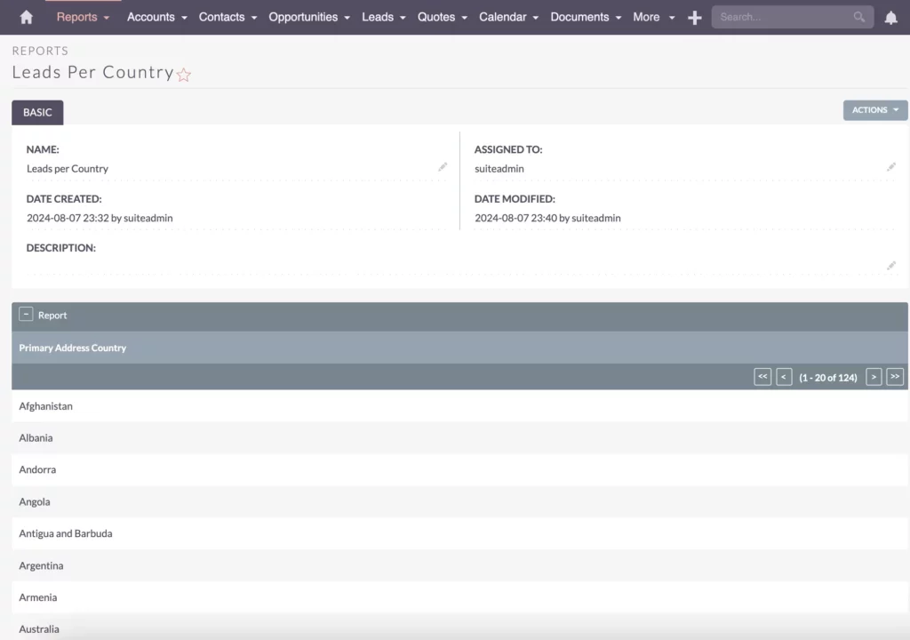
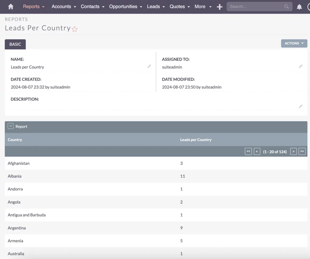
Suppose you want to get more details about your leads and see how many leads you have per country to identify the most viable countries for your marketing campaigns. To begin, open the Leads module. Then, navigate to the Reports module and start building your report.
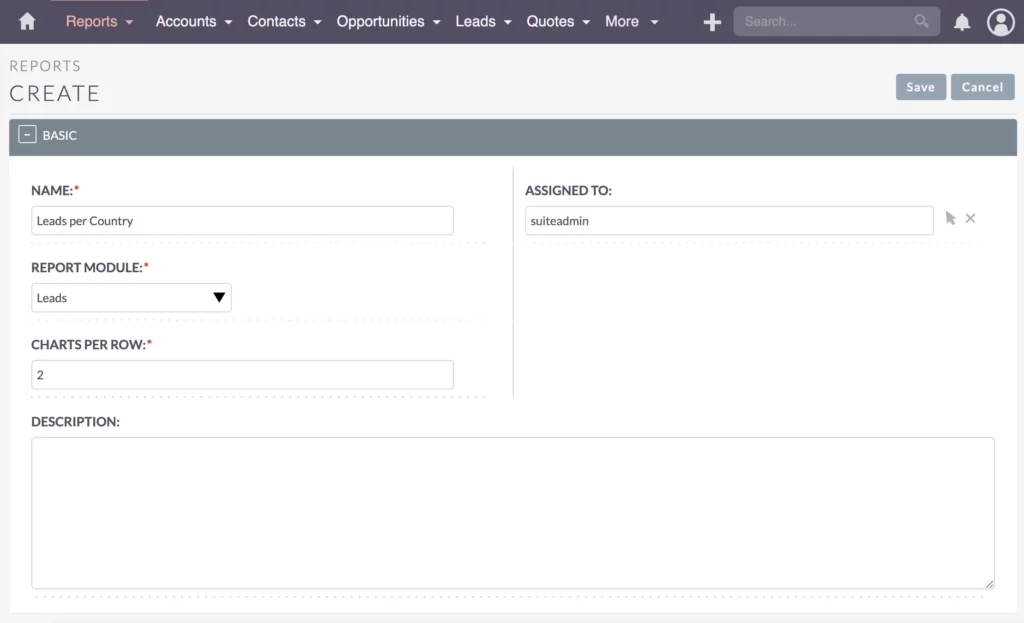
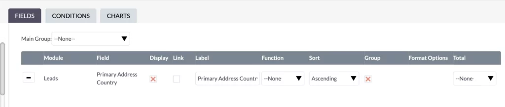
Create a new report and name it “Leads per Country.” Select the Leads module as the report module and choose the Primary Address Country field for this report.
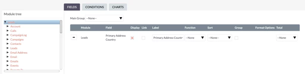
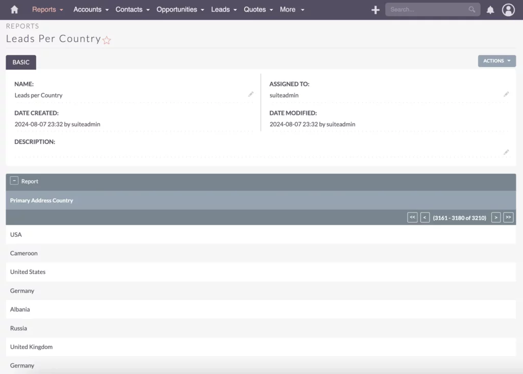
Start by generating a simple report to ensure everything is being reported correctly. This step is crucial as it provides an overview of your data, helping to spot mistakes and ensure accuracy.
Filtering Data
Filtering and Drilling Down the Data
To avoid mistakes and inaccuracies, filtering and drilling down the data is essential. For example, if there are countries without names, exclude them using conditions. Filtering out incorrect or missing data ensures that your reports are clean and reliable.
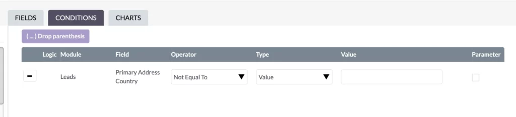
In this example, I want to ensure that the value is not equal to blank. By applying this filter and clicking save, you will see that there are no gaps in the report rows. While some gaps in the data might still exist, filtering helps exclude any incorrect or incomplete information, maintaining the overall accuracy of your report.
Grouping the Data Effectively
The next task is to count the leads. To do this, group and sort the data simultaneously. Grouping and sorting help organize the data meaningfully. Let’s see what happens.
Now, we have fewer entries because duplicates are grouped together. The list starts with A, B, and so on, which is correct. However, I’m missing the numbers. So far, this report doesn’t help much, since I can’t assume all the numbers.
For instance, if you’re grouping data by country to understand regional performance, you might also want to segment your leads more effectively to tailor your strategies. Check out my article on Lead Segmentation via Target Lists in Your SuiteCRM.
Applying Functions
Applying the Count Function
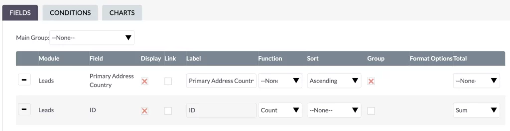
To fix this, add a Count function to group fields, typically using the ID field. Add the Count function and set the total to Sum to get a total of what’s displayed.
Rename labels to make them more meaningful, such as “Leads per Country” and “Country.”
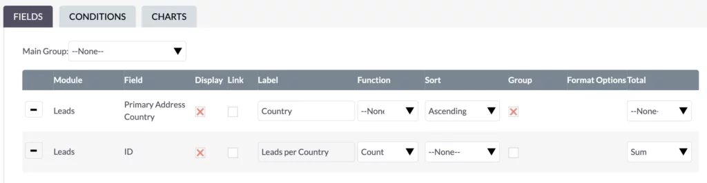
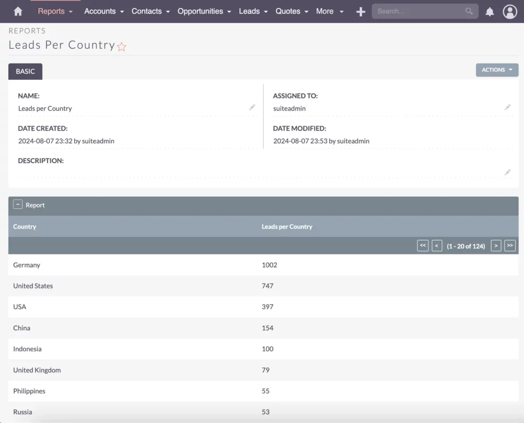
After clicking save, you can see the report looks much better.
Sorting Data
Sorting Data for Clarity
Next, sort the ID in descending order to see the largest numbers first.
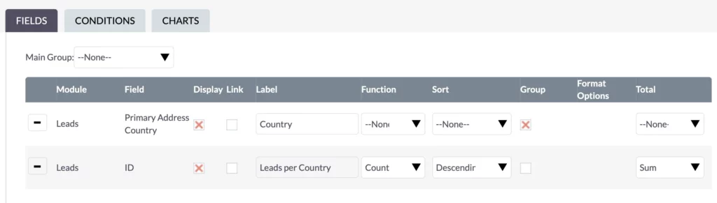
This ensures the most relevant data is at the top.

Be cautious about data quality.
For instance, “United States” and “USA” should be the same country to avoid duplication. Implement measures to maintain good data quality and migrate old data to a consistent format if necessary.
Bastian Hammer
Filtering Results
Refining Results with Filtering Conditions
To focus on specific countries, add filtering conditions to limit the report to those regions. For instance, select European countries such as France, Germany, Italy, and Sweden.
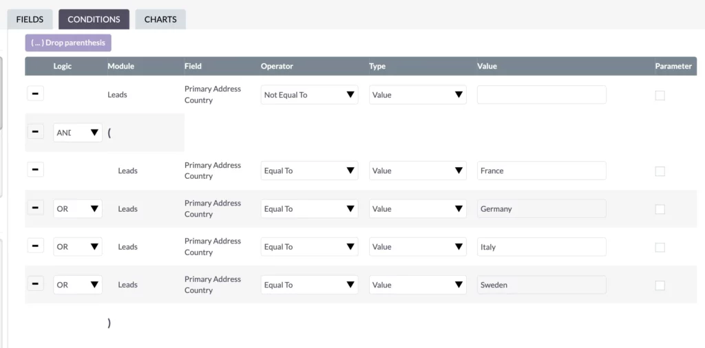
By grouping these countries and including them in your report, you can concentrate your marketing efforts more effectively.
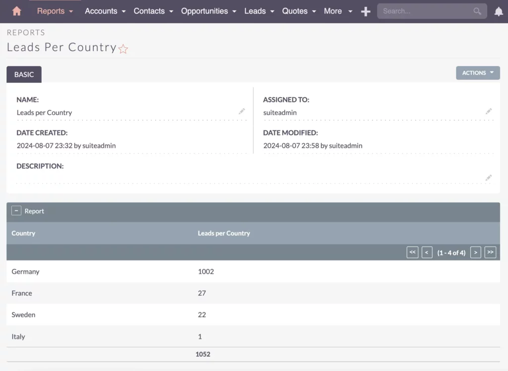
This allows you to see which countries are performing well and identify where additional marketing efforts are needed. These numbers provide specific answers to your business processes and strategic efforts. Therefore, you need to configure the reports to suit your needs.
Visualizing Data
Visualizing Data Insights
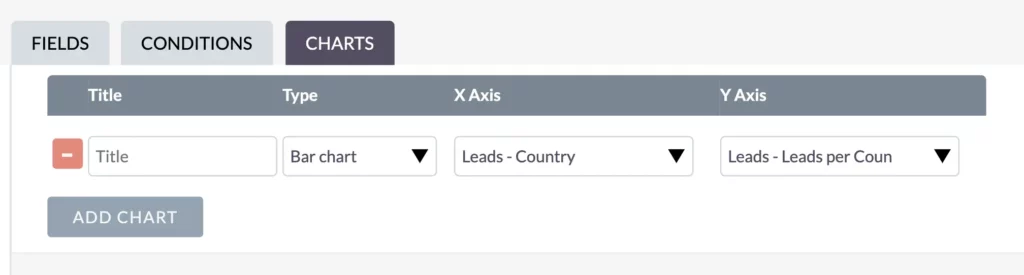
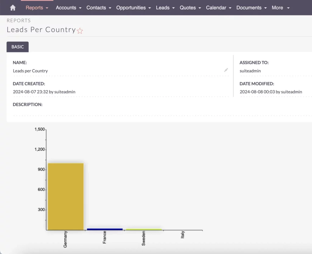
After verifying that the data is correct, add a graphical chart for better visualization. Create a bar chart with the country name on the x-axis and the lead count on the y-axis. This provides a clear, visual representation of your data.
Visualizing your data helps in understanding the distribution and trends within your data. A simple bar chart can illustrate the number of leads per country, highlighting the areas where your marketing efforts are most successful and where they need improvement.
Recap
A Recap on SuiteCRM Reporting and Grouping
In summary, we created a report with the correct columns, filtered and cleaned the data, applied grouping and counting functions, and added a chart for visualization. These steps ensure that your reports are accurate, insightful, and actionable.
Thank you for reading my guide on SuiteCRM reporting and grouping data. With these techniques, you can create comprehensive reports that drive strategic decisions and improve your business operations.
I hope you found this guide helpful in mastering SuiteCRM reporting. For more tips and insights on optimizing your CRM and other tech solutions, be sure to check out my other articles. See you next time!